建站,阁子记 · 阁子 建站,阁子记 2016-09-04 · 博客 · 6121 字 · 约 15 分钟 · 阅读 myfirst helloworld 建站 丙申九月,建站小记。
这两天趁着双休,学着搭了一下自己的blog,利用的是github的托管页面,用的是hexo的模板,申请了一个免费域名,自己添加了一些工具之类的,再准备陆续把以前自己在CSDN中的blog搬过来。 不知道有没有人能看得到,好像添加搜索那部分还有点问题,sitemap的url报错,不过总算是自己的空间了,虽然还是github提供的,今天忙这个两顿饭都忘记准时吃了,都是吃的汉堡,虽然有点累,但是开辟自己的空间的感觉真的很不错。 不过不知道能不能坚持,我对自己向来是不惮报以最坏的期望的,多少年都在证明这样做的正确性。不过对于进来的人,献上欢迎的花儿,还有飞吻。
现在记一下,博客搭建过程。 安装Nodejs和git自然不用多说。 然后选择主题,我选择的是一个透明的主题,不过这个主题的作者貌似很懒,只有透明效果。 然后布局和插件自己布置。 关于访问统计,一共用了百度统计/谷歌统计/腾讯统计,不过这些都是后台统计,显示在网页用的是不蒜子。 百度统计和腾讯统计直接在_partial下新建一个ejs,然后把获得的代码粘贴进去就行了。谷歌统计也有通用的模板,把id粘贴进去就行。最后在主题的配置文件里写一下。有的主题已经内置了百度和谷歌的统计代码的,只需要填入id就行,上面是说的没有的情况。 添加微博秀,直接到复制微博秀的代码。也是新建一个ejs文件,然后添加一个wedjet 修改背景,添加归档Archives,添加sitemap,提交谷歌搜索。 添加404,添加外链。 hexo方法大致一致,都是在百度谷歌现学现用。 以后有时间自己再做个主题, 以后有时间在用flask搭一个博客, 以后有时间,,, 不知道说什么了。
修改了next主题后的一些配置(后加)
把侧边栏头像变成圆形,并且鼠标停留在上面发生旋转效果 主要方法:修改themes/next/source/css/_common/components/sidebar/sidebar-author.styl
css . site-author-image { display : block ; margin : 0 auto ; padding : $site-author-image-padding ; max-width : $site-author-image-width ; height : $site-author-image-height ; border : $site-author-image-border-width solid $site-author-image-border-color ; /* 头像圆形 */ border-radius : 80 px ; -webkit-border-radius : 80 px ; -moz-border-radius : 80 px ; box-shadow : inset 0 -1 px 0 # 333 sf ; /* 设置循环动画 [animation: (play)动画名称 (2s)动画播放时长单位秒或微秒 (ase-out)动画播放的速度曲线为以低速结束 (1s)等待1秒然后开始动画 (1)动画播放次数(infinite为循环播放) ]*/ -webkit-animation : play 2 s ease-out 1 s 1 ; -moz-animation : play 2 s ease-out 1 s 1 ; animation : play 2 s ease-out 1 s 1 ; /* 鼠标经过头像旋转360度 */ -webkit-transition : -webkit-transform 1.5 s ease-out ; -moz-transition : -moz-transform 1.5 s ease-out ; transition : transform 1.5 s ease-out ; } img : hover { /* 鼠标经过停止头像旋转 -webkit-animation-play-state:paused; animation-play-state:paused;*/ /* 鼠标经过头像旋转360度 */ -webkit-transform : rotateZ ( 360 deg ); -moz-transform : rotateZ ( 360 deg ); transform : rotateZ ( 360 deg ); } /* Z 轴旋转动画 */ @ -webkit-keyframes play { 0% { -webkit-transform : rotateZ ( 0 deg ); } 100% { -webkit-transform : rotateZ ( -360 deg ); } } @ -moz-keyframes play { 0% { -moz-transform : rotateZ ( 0 deg ); } 100% { -moz-transform : rotateZ ( -360 deg ); } } @ keyframes play { 0% { transform : rotateZ ( 0 deg ); } 100% { transform : rotateZ ( -360 deg ); } } . site-author-name { margin : $site-author-name-margin ; text-align : $site-author-name-align ; color : $site-author-name-color ; font-weight : $site-author-name-weight ; } . site-description { margin-top : $site-description-margin-top ; text-align : $site-description-align ; font-size : $site-description-font-size ; color : $site-description-color ; } 添加nest背景特效: 打开next/layout/_layout.swig,在
{% if theme.canvas_nest %}
<script type="text/javascript" src="//cdn.bootcss.com/canvas-nest.js/1.0.0/canvas-nest.min.js"></script>
{% endif %}
打开/next/_config.yml,添加以下代码:
# --------------------------------------------------------------
# background settings
# --------------------------------------------------------------
# add canvas-nest effect
# see detail from https://github.com/hustcc/canvas-nest.js
canvas_nest: true
文章链接唯一化 文章题目或者变更文章发布时间会经常更改,在默认设置下,文章链接都会改变,不利于搜索引擎收录,也不利于分享。唯一永久链接才是更好的选择。安装此插件后,不要在hexo s模式下更改文章文件名,否则文章将成空白。
bash npm install hexo-abbrlink --save 修改站点配置文件:
yaml permalink : posts/:abbrlink/ # “posts/” 可自行更换 # abbrlink config abbrlink : alg : crc32 # 算法:crc16(default) and crc32 rep : hex # 进制:dec(default) and hex 可选择模式:
crc16 & hex crc16 & dec crc32 & hex crc32 & dec 添加宠物(虽然没卵用) 回到博客目录:
bash npm install -save hexo-helper-live2d 然后打开Hexo/blog/themes/next/layout的_layout.swig,将下面代码放到之前:
{{ live2d() }}
然后在在 hexo 的_config.yml 中添加参数:
yaml live2d : model : wanko bottom : -30 下面是一些model,可以换不同的宠物:
* Gantzert_Felixander
* Epsilon2.1
* haru
* miku
* ni-j
* nico
* nito
* nipsilon
* nietzsche
* shizuku
* tsumiki
* wanko
* z16
* hibiki
* koharu
* haruto
* Unitychan
* tororo
* hijiki
* width 宽度 默认值: 150
* height 高度 默认值: 300
* className 元素的类名 默认值: live2d
* id 元素的id 默认值: live2dcanvas
* bottom 元素的底部偏移 默认值: -20 如果嫌模型位置不正确 可以调整这个参数
详细地址:https://huaji8.top/post/live2d-plugin-2.0/
首页title的优化 更改index.swig文件,文件路径是your-hexo-site\themes\next\layout,将下面代码
{% block title %} {{ config.title }} {% endblock %}
改成:
{% block title %} {{ config.title }} - {{ theme.description }} {% endblock %}
添加mob_share SDK分享 方法:在_config.xml中添加
yaml #Share mob_share : enable : true appkey : * ******* 然后添加mob模块: 在next/layout/_partials/share/文件夹中新建一个mob_share.swig文件,内容为:
		<!--MOB SHARE BEGIN-->
		<div class="-mob-share-ui-button -mob-share-open">分享</div>
		<div class="-mob-share-ui"  -mob-share-ui-theme -mob-share-ui-theme-slide-bottom style="display: none">
		<ul class="-mob-share-list">
			<li class="-mob-share-weixin"><p>微信</p></li>
			<li class="-mob-share-qzone"><p>QQ空间</p></li>
			<li class="-mob-share-weibo"><p>新浪微博</p></li>
			<li class="-mob-share-facebook"><p>Facebook</p></li>
			<li class="-mob-share-twitter"><p>Twitter</p></li>
			<li class="-mob-share-pocket"><p>Pocket</p></li>
			<li class="-mob-share-tumblr"><p>Tumblr</p></li>
			<li class="-mob-share-google"><p>Google+</p></li>
			<li class="-mob-share-linkedin"><p>Linkedin</p></li>
			<li class="-mob-share-qq"><p>QQ好友</p></li>
			<li class="-mob-share-tencentweibo"><p>腾讯微博</p></li>
			<li class="-mob-share-renren"><p>人人网</p></li>
			<li class="-mob-share-douban"><p>豆瓣</p></li>
			<li class="-mob-share-youdao"><p>有道云笔记</p></li>
			<li class="-mob-share-instapaper"><p>Instapaper</p></li>
		</ul>
		<div class="-mob-share-close">取消</div>
		</div>
		<div class="-mob-share-ui-bg"></div>
		<script id="-mob-share" src="http://f1.webshare.mob.com/code/mob-share.js?appkey={{theme.mob_share.appkey}}"></script>
<!--MOB SHARE END-->然后添加引用,在next/layout/post.swig文件中,添加一行即可。
{% elseif theme.mob_share.enable %}
      {% include '_partials/share/mob_share.swig' %}
后来添加了一些插件: hexo-ruby-character插件 插件主要用来给文字注音啥的,具体效果见官方repo
bash npm install hexo-ruby-character --save 使用方法:
{% ruby Base|top %}
Basetop
hexo-pdf插件 用来在文档中插入pdf的,官方repo 安装:
bash npm install --save hexo-pdf 用法:
{% pdf http://7xov2f.com1.z0.glb.clouddn.com/bash_freshman.pdf %}图片懒加载 虽然图片不多,没多大用,不过还是用了,想着稍微能提速一点。官方repo 安装:
bash npm install hexo-lazyload-image --save 配置:
yaml lazyload : enable : true onlypost : false loadingImg : # eg. ./images/loading.png 添加DaoVoice插件 首先在Daovoice官网注册一个账号,新建一个应用,然后进入应用,选择安装到网站,获取 接入代码 和 app_id。
yaml daovoice : enable : true app_id : * ***** 然后编写 DaoVoice 接入代码:
找到themes/next/lauout/_third-party/目录,在该目录下新增 daovoice/daovoice.swig 文件,然后在daovoice文件中写入:
{% if theme.daovoice.enable %}
   <script>
     (function(i,s,o,g,r,a,m){
     i["DaoVoiceObject"]=r;
     i[r]=i[r]||function(){
     (i[r].q=i[r].q||[]).push(arguments)},
     i[r].l=1*new Date();
     a=s.createElement(o),
     m=s.getElementsByTagName(o)[0];
     a.async=1;
     a.src=g;
     a.charset="utf-8";
     m.parentNode.insertBefore(a,m)
     })(window,document,"script",('https:' == document.location.protocol ? 'https:' : 'http:') + "//widget.daovoice.io/widget/{{ theme.daovoice.app_id }}.js","daovoice")
     daovoice('init', {
     app_id: "{{ theme.daovoice.app_id }}"
     });
     daovoice('update');
   </script>
 {% endif %}
然后再在模板文件里引入 DaoVoice 接入代码: 找到themes/next/lauout/_layout.swig文件,引入刚才写的 daovoice.swig 文件。
{% include '_third-party/daovoice/daovoice.swig' %}
隐藏底部powered一栏 打开hexo/themes/next/layout/_partials/footer.swig,使用<!-- -->隐藏之间的代码即可。或者直接删除
修改底栏心形图标 直接去fontawesome网站找到对应的图标名字,在主题配置文件中替换掉heart就行。
主页文章添加阴影效果 打开\themes\next\source\css_custom\custom.styl,向里面加入:
css // 主页文章添加阴影效果 . post { margin-top : 60 px ; margin-bottom : 60 px ; padding : 25 px ; -webkit-box-shadow : 0 0 5 px rgba ( 202 , 203 , 203 , .5 ); -moz-box-shadow : 0 0 5 px rgba ( 202 , 203 , 204 , .5 ); } 修改页面底部标签分类的#号 修改模板/themes/next/layout/_macro/post.swig,搜索 rel=”tag”>#,将 # 换成喜欢的图标,具体可以去FontAwesome网站去找。
添加脚注 bash npm install hexo-reference --save 用法:
basic footnote[^1]
here is an inline footnote[^2](inline footnote)
and another one[^3]
and another one[^4]

[^1]: basic footnote content
[^3]: paragraph
footnote
content
[^4]: footnote content with some [markdown](https://en.wikipedia.org/wiki/Markdown)
添加居中模块 用HTML代码:
html < blockquote class = " blockquote-center " > 优秀的人,不是不合群,而是他们合群的人里面没有你 </ blockquote > 添加鼠标特效 新建一个js:
bash vim themes/next/source/js/src/mouse.js 在里面输入:
javascript /* 鼠标特效 */ var a_idx = 0 ; jQuery ( document ). ready ( function ( $ ) { $ ( " body " ). click ( function ( e ) { var a = new Array ( " 富强 " , " 民主 " , " 文明 " , " 和谐 " , " 自由 " , " 平等 " , " 公正 " , " 法治 " , " 爱国 " , " 敬业 " , " 诚信 " , " 友善 " ); var $i = $ ( " <span/> " ). text ( a [ a_idx ]); a_idx = ( a_idx + 1 ) % a . length ; var x = e . pageX , y = e . pageY ; $i . css ({ " z-index " : 999999999999999999999999999999999999999999999999999999999999999999999 , " top " : y - 20 , " left " : x , " position " : " absolute " , " font-weight " : " bold " , " color " : " #ff6651 " }); $ ( " body " ). append ( $i ); $i . animate ({ " top " : y - 180 , " opacity " : 0 }, 1500 , function () { $i . remove (); }); }); }); 然后在Blog\themes\next\layout\_layout.swig文件的最下方,</body>前面添加<script type="text/javascript" src="/js/src/mouse.js"></script>。
添加时钟 在next\layout\_macro中找到sidebar.swig(侧边导航栏),在合适的位置加入一下代码:
<div class="swf_clock" align="center">
<embed name="honehoneclock" width="160" height="70" align="middle" pluginspage="http://www.macromedia.com/go/getflashplayer" src="http://chabudai.sakura.ne.jp/blogparts/honehoneclock/honehone_clock01.swf" type="application/x-shockwave-flash" wmode="transparent" quality="high" bgcolor="#ffffff" allowscriptaccess="always">
</div>
给页面添加背景图片 在theme/next/source/css/_custom文件夹下打开custom.styl文件,往里面添加以下代码:
css body { background : url ( 图片链接 ); background-size : cover ; background-repeat : no-repeat ; background-attachment : fixed ; background-position : center ; } 文字背景色以及半透明的设置 一样,在theme/next/source/css/_custom文件夹下打开custom.styl文件,往里面添加以下代码:
css . content { border-radius : 10 px ; margin-top : 60 px ; background : rgba ( 颜色rgb , 透明度 ) none repeat scroll !important ; } 其中border-radius是给文章背景设置圆角,margin-top是设置文章到顶部的距离,其中属性可根据自己的需要进行调整。 在修改完文章背景色之后,文字颜色可能和背景色不能很好的搭配,这时候我们就需要修改文章字体的颜色了。打开theme/next/source/css/_common/scaffolding文件夹下的base.styl文件,找到body{},将其中的color:$text-color更改为你想要的颜色即可。代码如下:
css body { position : relative ; /* Required by scrollspy */ font-family : $font-family-base ; font-size : $font-size-base ; line-height : $line-height-base ; color : 颜色代码 ; background : $body-bg-color ; + mobile () { padding-right : 0 !important ; } + tablet() { padding-right : 0 !important ; } + desktop-large() { font-size : $font-size-large ; } } 文章页面宽度设置 还是在theme/next/source/css/_custom文件夹下打开custom.styl文件,往里面添加以下代码:
main-inner {width: 页面宽度;}
文章内单行代码的样式设置 如果更改了网页底色,单行代码的颜色可能与背景色不搭配,这时就需要我们自己设置了。在theme/next/source/css/_custom文件夹下打开custom.styl文件,往里面添加以下代码:
css # posts code { color : 颜色代码 ; background-color : 颜色代码 ;} 网页顶部和底部的文字颜色修改 头部文字颜色 更改头部site-title的字体颜色 在theme/next/source/css/_common/components/header文件夹下打开site-meta.styl文件,找到.brand{}向里面添加以下代码: color: 颜色代码 !important;
更改头部menu的字体颜色 在相同的文件夹下打开menu.styl文件,找到a{},向里面添加以下代码: color: 颜色代码 !important;底部文字颜色 底部文字颜色的修改就显得很简单了,还是在theme/next/source/css/_custom文件夹下打开custom.styl文件,往里面添加以下代码:
.footer-inner {color: 颜色代码;}
侧栏背景图以及内部文字颜色的修改 还是在theme/next/source/css/_custom文件夹下打开custom.styl文件,往里面添加以下代码:
#sidebar {
            background:url(图片链接);
            background-size: cover;
            background-position:center;
            background-repeat:no-repeat;
            p,span,a {color: 颜色代码;}
}其中设置p,span,a{color:颜色代码},即可修改侧边栏内部文字的颜色。
修改Mist风格下的侧边栏位置为左边 此设置为修改next主题Mist风格下侧边栏的位置为左边(默认为右边)以及侧边栏变化后页面变化的方向,具体操作如下:
更改页面变化方向: 首先,打开next/source/js/src文件夹下的motion.js文件Ctrl+F查找paddingRight;把所有(2个)PaddingRight更改为paddingLeft即可。 代码样式如下:
{paddingLeft: SIDEBAR_WIDTH},
NexT.utils.isDesktop() && $('body').velocity('stop').velocity({paddingLeft: 0});
打开next/source/css/_common/components/sidebar文件夹下的sidebar.styl文件,将.sidebar{}内的right: 0;改为left: 0;,形式如下:
.sidebar {
              position: fixed;
              left: 0;
打开相同路径下的sidebar-toggle.styl文件,将.sidebar-toggle{}内的right: $b2t-position-right;改为left: $b2t-position-right;,形式如下: .sidebar-toggle {
position: fixed;
left: $b2t-position-right;
返回上一个文件夹,打开back-to-top.styl文件,将.back-to-top {}内的right: $b2t-position-right;改为left: $b2t-position-right;,形式如下: .back-to-top {
box-sizing: border-box;
position: fixed;
bottom: $b2t-position-bottom;
left: $b2t-position-right;修正侧边栏在左边时的小BUG BUG描述:在更改浏览器大小的时候,顶部栏和底部栏未和侧边栏同步。 解决方法:在themes/next/layout/source/js/src文件夹下打开motion.js文件,在$(document).ready(function (){}顶部其中添加代码
javascript window . onload = function (){ var bwol = document . body . offsetWidth ; if ( bwol < 975 ){ $ ( ' aside#sidebar ' ). css ( " display " , " none " ); $ ( ' body ' ). css ( " paddingLeft " , " 0px " ); } } window . onresize = function (){ var bwos = document . body . offsetWidth ; bwos < 975 && $ ( ' body ' ). velocity ( ' stop ' ). velocity ({ paddingLeft : 0 }, 0 ); if ( $ ( ' aside#sidebar ' ). css ( ' display ' ) != ' none ' && $ ( ' aside#sidebar ' ). css ( ' width ' ) != ' 0px ' ) $ ( ' body ' ). velocity ( ' stop ' ). velocity ({ paddingLeft : 350 }, 0 ); } 更改侧边栏控制按钮的样式 在themes/next/layout/source/js/src文件夹下打开motion.js文件,在顶部其中更改代码。找到以下代码的位置:
var sidebarToggleLine1st = new SidebarToggleLine();
var sidebarToggleLine2st = new SidebarToggleLine();
var sidebarToggleLine3st = new SidebarToggleLine();
将其内部内容更改为以下内容:
var sidebarToggleLine1st = new SidebarToggleLine({
    el: '.sidebar-toggle-line-first',
    status: {
      arrow: {width: '50%', rotateZ: '45deg', top: '2px', left: '6px'},
      // close: {width: '100%', rotateZ: '-45deg', top: '5px', left: '0px'} //叉字形
      close: {width: '50%', rotateZ: '-45deg', top: '2px', left: '0px'} //箭头形
    }
  });
  var sidebarToggleLine2nd = new SidebarToggleLine({
    el: '.sidebar-toggle-line-middle',
    status: {
      arrow: {width: '90%'},
      // close: {opacity: 0}  //箭头形
      close: {width: '90%'}
    }
  });
  var sidebarToggleLine3rd = new SidebarToggleLine({
    el: '.sidebar-toggle-line-last',
    status: {
      arrow: {width: '50%', rotateZ: '-45deg', top: '-2px', left: '6px'},
      // close: {width: '100%', rotateZ: '45deg', top: '-5px', left: '0px'} //叉字形
      close: {width: '50%', rotateZ: '45deg', top: '-2px', left: '0px'} //箭头形
    }
  });
添加侧边栏头像的链接 修改鼠标样式: 在themes/next/layout/source/css/_common/componets/sidebar文件夹下打开sidebar-author.styl文件,在.site-author-image{}内添加cursor: pointer;形如:
css . site-author-image { display : block ; margin : 0 auto ; padding : $site-author-image-padding ; max-width : $site-author-image-width ; height : $site-author-image-height ; border : $site-author-image-border-width solid $site-author-image-border-color ; cursor : pointer ; } 添加链接: 在themes/next/layout/source/js/src文件夹下打开motion.js文件,在顶部其中添加代码:
javascript $ ( ' .site-author-image ' ). click ( function (){ window . location . href = " 自定义链接 " ; }); 设置鼠标划入侧边栏才显示站点信息: 在theme/next/layout/_macro文件夹下打开sidebar.swig文件,找到以下代码行的位置:
<nav class="site-state motion-element">
在其上添加以下代码:
html <!--my custom code begin--> < script src = " https://cdnjs.cloudflare.com/ajax/libs/jquery/3.1.0/jquery.min.js " ></ script > < script src = " https://cdnjs.cloudflare.com/ajax/libs/velocity/1.5.0/velocity.min.js " ></ script > < script type = " text/javascript " > $ ( " #sidebar " ). hover ( function (){ $ ( " #mydivshow " ). velocity ( ' stop ' ). velocity ({ opacity : 1 }); }, function (){ $ ( " #mydivshow " ). velocity ( ' stop ' ). velocity ({ opacity : 0 }); }); </ script > < div id = " mydivshow " class = " mydivshow " > <!--my custom code end--> 然后找到代码行:
</section>
{% if display_toc and toc(page.content).length > 1 %}
<!--noindex-->
<section class="post-toc-wrap motion-element sidebar-panel sidebar-panel-active">
在此的上方添加一个,如下所示:
<!--my custom code begin-->
</div>
<!--my custom code end-->
</section>
{% if display_toc and toc(page.content).length > 1 %}
<!--noindex-->
  <section class="post-toc-wrap motion-element sidebar-panel sidebar-panel-active">
    <div class="post-toc">
自定义区域的初始化设置 在theme/next/source/css/_custom文件夹下打开custom.styl文件,向里面增添下列代码:
#mydivshow{opacity: 0;}
注:具体代码添加位置以及代码里的section.site-overview可以自己修改,
和末尾的
是控制显示区域,section.site-overview则是用户鼠标滑入划出时的触发事件区域。
自定义音乐播放器 安装APlayer插件 bash npm install aplayer --save 安装完后在node_modules目录下找到APlayer.min.js文件,将其复制到theme/next/source/js/src/目录下。
生成音乐播放器 在你想要加入音乐播放器的地方插入以下代码, 本站把他放在了侧边栏里,具体操作如下。 打开theme/next/layout/_custom/文件夹下的sidebar.swig文件,向其中添加以下代码:
html < div id = " player1 " class = " aplayer " ></ div > < script src = " /js/src/APlayer.min.js " ></ script > < script type = " text/javascript " > var ap = new APlayer ({ element : document . getElementById ( ' player1 ' ), // Optional, player element narrow : false , // Optional, narrow style autoplay : true , // Optional, autoplay song(s), not supported by mobile browsers showlrc : 0 , // Optional, show lrc, can be 0, 1, 2, see: ###With lrc mutex : true , // Optional, pause other players when this player playing theme : ' #e6d0b2 ' , // Optional, theme color, default: #b7daff mode : ' random ' , // Optional, play mode, can be `random` `single` `circulation`(loop) `order`(no loop), default: `circulation` preload : ' metadata ' , // Optional, the way to load music, can be 'none' 'metadata' 'auto', default: 'auto' listmaxheight : ' 513px ' , // Optional, max height of play list music : { // Required, music info, see: ###With playlist title : ' Preparation ' , // Required, music title author : ' Hans Zimmer/Richard Harvey ' , // Required, music author url : ' http://7xifn9.com1.z0.glb.clouddn.com/Preparation.mp3 ' , // Required, music url pic : ' http://7xifn9.com1.z0.glb.clouddn.com/Preparation.jpg ' , // Optional, music picture lrc : ' [00:00.00]lrc here \n [00:01.00]aplayer ' // Optional, lrc, see: ###With lrc } }); </ script > 自定义播放器样式 包含颜色更改,列表歌曲信息的排版修改。 在theme/next/source/css/_custom文件夹下打开custom.styl文件,往里面添加以下代码:
css . aplayer-list ol li : hover { /*列表悬停颜色*/ background : rgba ( 颜色代码 , 透明度 ) none repeat scroll !important ;} . aplayer-list ol li { /*列表底色*/ background : rgba ( 颜色代码 , 透明度 );} . aplayer-list-light { /*列表播放歌曲颜色*/ background : rgba ( 颜色代码 , 透明度 ) none repeat scroll !important ;} # player1 { /*边框样式*/ border-radius : 6 px ; div , ol { border-radius : 6 px ;} } # player1 * { color : 颜色代码 ;} /*字体颜色*/ /*列表歌曲信息的排版*/ . aplayer-list-index { float : left ;} . aplayer-list-title { float : left ;} . aplayer-list-author { float : right ;} 自定义萌萌哒音乐播放控制边栏 bash npm install aplayer-controler --save 仓库链接
DOS风格的404页面 效果在这里
博客自动部署 刚开始是准备用AppVeyor的,托管在github上,教程在这里 这里
live2d插件手机端隐藏 由于现在这个模型在手机上比较大,而且不是很清晰,视觉效果不是很好,所以决定在手机端隐藏。 方法很简单,判断一下是否移动端即可。 在theme/next/source/css/_custom文件夹下打开custom.styl文件,往里面添加以下代码:
#live2dcanvas { +mobile() { display: none; } } Gitment评论插件 最初用的多说,后来多说挂了,之后采用来必力,看起来挺好看的,而且next主题也集成了这个插件,但是后端都是不靠谱的啊!这两天又抽风了,完全加载不出来,官方还没挂,但是页面已经显示不了了。最后还是决定采用Gayhub的评论系统,集成Gitment插件。Gitment的作者是imsun,其项目主页在这 .
{% if theme.gitment.enable %}
   {% set owner = theme.gitment.githubID %}
   {% set repo = theme.gitment.repo %}
   {% set cid = theme.gitment.ClientID %}
   {% set cs = theme.gitment.ClientSecret %}
   <link rel="stylesheet" href="https://imsun.github.io/gitment/style/default.css">
   <script src="https://imsun.github.io/gitment/dist/gitment.browser.js"></script>
   {% if not theme.gitment.lazy %}
       <script type="text/javascript">
           var gitment = new Gitment({
               id: window.location.pathname,
               owner: '{{owner}}',
               repo: '{{repo}}',
               oauth: {
                   client_id: '{{cid}}',
                   client_secret: '{{cs}}',
               }});
           gitment.render('gitment-container');
       </script>
   {% else %}
       <script type="text/javascript">
           function ShowGitment(){
               document.getElementById("gitment-display-button").style.display = "none";
               document.getElementById("gitment-container").style.display = "block";
               var gitment = new Gitment({
                   id: document.location.href,
                   owner: '{{owner}}',
                   repo: '{{repo}}',
                   oauth: {
                       client_id: '{{cid}}',
                       client_secret: '{{cs}}',
                   }});
               gitment.render('gitment-container');
           }
       </script>
   {% endif %}
{% endif %}{% include 'gitment.swig' %}设置按钮样式 按钮样式可以放在css的文件夹下,具体目录是之前的source/css/_common/components/third-party/文件夹。在其中添加gitment.styl样式设置文件。
css # gitment-display-button { display : inline-block ; padding : 0 15 px ; color : # 0a9caf ; cursor : pointer ; font-size : 14 px ; border : 1 px solid # 0a9caf ; border-radius : 4 px ; } # gitment-display-button : hover { color : # fff ; background : # 0a9caf ; } 具体button的样式可以自己修改里面的参数。source/css/_common/components/third-party/third-party.styl文件中引入相应的CSS样式:
@import "gitment";
在主题的en.yml增加:
gitmentbutton: Show comments from Gitmentzh-Hans.yml增加:
gitmentbutton: 显示 Gitment 评论
修改主题评论代码 在layout/_partials/comments.swig文件中找到最后一个if分支,应该是这两句:
{% elseif theme.valine.appid and theme.valine.appkey %}
      <div id="vcomments"></div>
在最后一个if分支后加一个Gitment的:
{% elseif theme.gitment.enable %}
   {% if theme.gitment.lazy %}
     <div onclick="ShowGitment()" id="gitment-display-button">{{  __('gitmentbutton') }}</div>
     <div id="gitment-container" style="display:none"></div>
   {% else %}
     <div id="gitment-container"></div>
   {% endif %}
在主题配置文件中加入开启Gitment评论: yaml # Gitment # Introduction: https://imsun.net/posts/gitment-introduction/ gitment : enable : true githubID : #your github ID repo : #your comment repo ClientID : ------ ClientSecret : ------ lazy : false OK,到这里基本上是完成了。
Hexo中插入流程图 因为hexo中的markdown语法并未支持流程图,或者说流程图语法现在并不是markdown的基本语法。但在挖坑填坑过程中,偶尔需要解释清楚一个Pipeline的时候,还是需要流程图的。偶然发现了一个插件,hexo-filter-flowchart,官方Repo在此 .
安装 在blog根目录下使用npm安装:
bash npm install --save hexo-filter-flowchart 配置站点文件(可选) 可以在站点配置文件中修改默认的样式。
yaml vim _config.xml flowchart : # raphael: # optional, the source url of raphael.js # flowchart: # optional, the source url of flowchart.js options : # options used for `drawSVG` 流程图用法 一般是三个反引号加flow开始,最后三个反引号结束。其中语法示例如下:
st=>start: Start
e=>end
op=>operation: My Operation
cond=>condition: Yes or No?

st->op->cond
cond(yes)->e
cond(no)->op
最后效果如下:
Hexo中插入序列图 安装 官方Repo在这 ,一样的,安装一个插件:
bash npm install --save hexo-filter-sequence 加速 修改node_modules/hexo-filter-sequence/index.js文件,将其中的cndjs.cloudflare.com替换成cdnjs.cat.net。
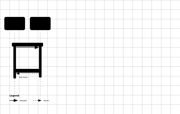
序列图绘制 一般是三个反引号加一个sequence开始,以三个反引号结束。 示例:
Alice->Bob: Hello Bob, how are you?
Note right of Bob: Bob thinks
Bob-->Alice: I am good thanks!
在反引号后加上sequence后效果如下:
加速 修改node_modules/hexo-filter-flowchart/index.js文件,将其中的cndjs.cloudflare.com替换成cdnjs.cat.net。
插入视频 使用Dplayer插件。效果如下:
{% dplayer "url=https://******.mp4" "http://******.jpg" "api=https://api.prprpr.me/dplayer/" "id=" "loop=false" %}而且,,,dplayer和live2d冲突了,导致无法显示live2d,而且这么久了也没见dplayer改,也就没用了。 不过对于B站,现在不能直接提取外链了,感觉直接用iframe更方便一点: